Years ago, an employer had just started a side project. The 26 line was created primarily for runners. The clothing designers were ever changing and we (the photographers and myself) needed to keep up, and create images and web and advertisements mock-ups for the owners and other agencies. Below are are some of the examples.
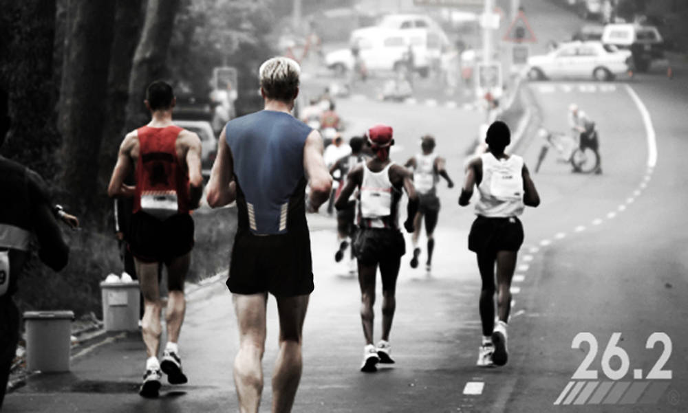
When it comes to Athletic advertisements, I prefer movement, and action, to bring of memories of a favoured run. Showing groups also help set a few emotions. one is the thrill of the race. The other, is you are not alone.
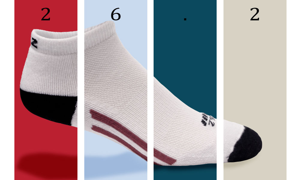
Socks separated into segments with colors, to help bring out the item.
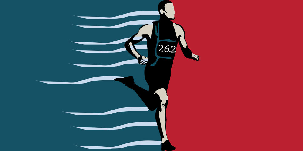
The second of two ads using the same color scheme. I also kept the design simple.
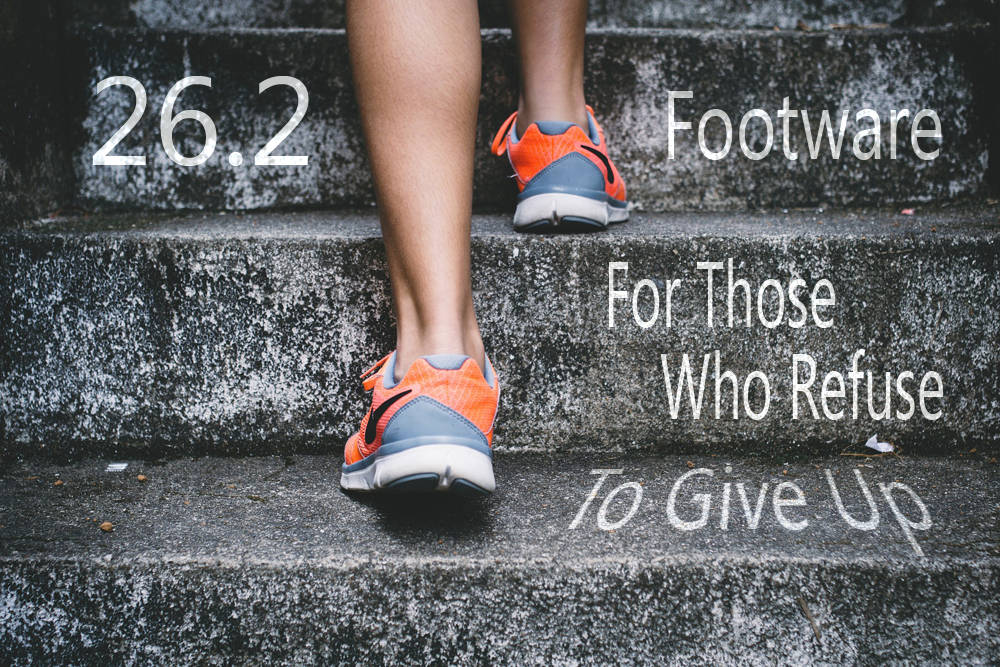
Running Stairs Advertisements. Again movement, but with close up of the product, and using one of the 26 brand phrases.
The following images were for a test site of limited power. A selection of sports apparel, and site banners for the site follow.
Below our two signs envisions by the client. I made them to their specifications, which they liked.
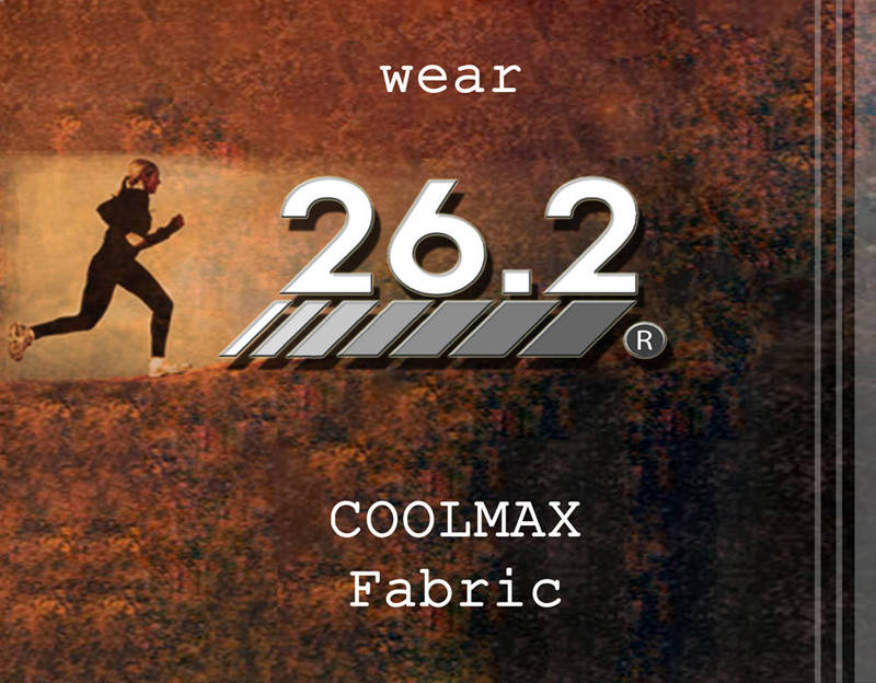
The banners were for the test website. More images involving movement. The text was given to myself to add.
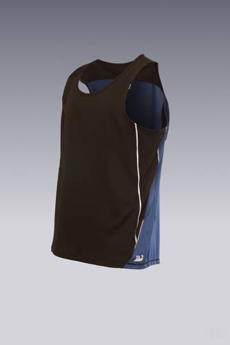
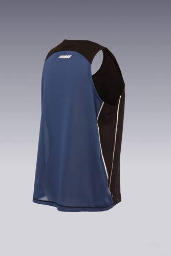
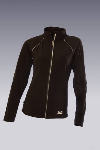
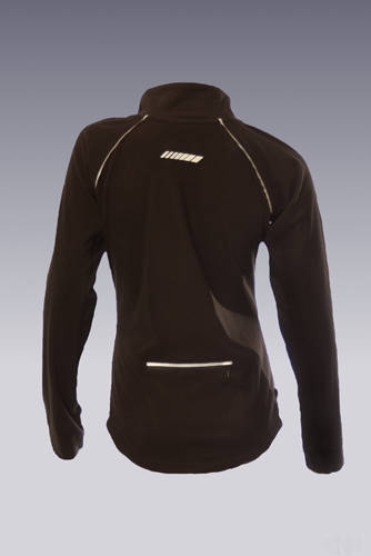
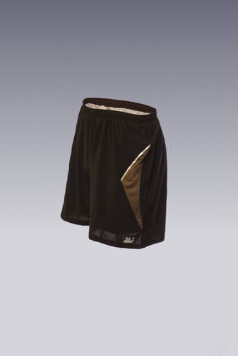
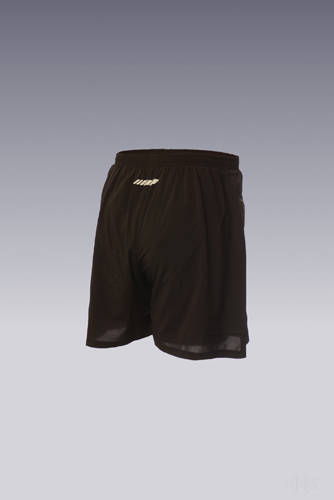
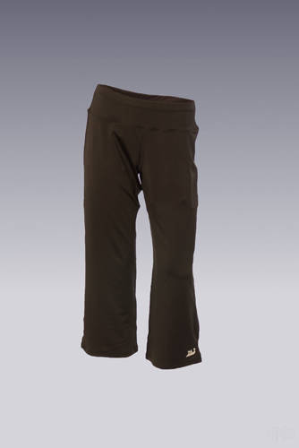
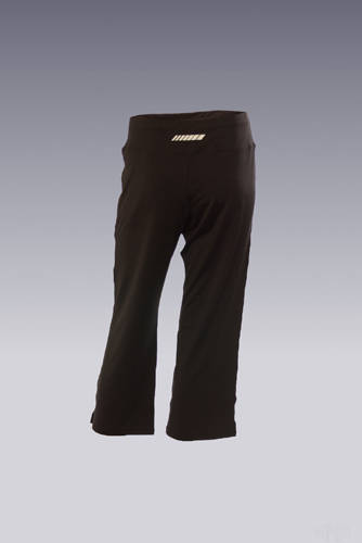
Photographs taken by two photographers, and edited to show shape by me. I would have the photographer take a few angles, to help me fill in any gaps where the mannequin would cover the clothing.
A few images from the cloths line. I decided to go for the hollow look, instead of the previous flat look.
