
Overview For Anthony-Thomas GalleryThis gallery deals with advertisement both physical such as signs and banners, and digital, for websites and email advertisements. Below are are some of the examples. Some images of product were used from the company's stock footage, the newer images were photographed by me. Due to constraints, I built my own studio with assorted lights, and light-box of my own design.
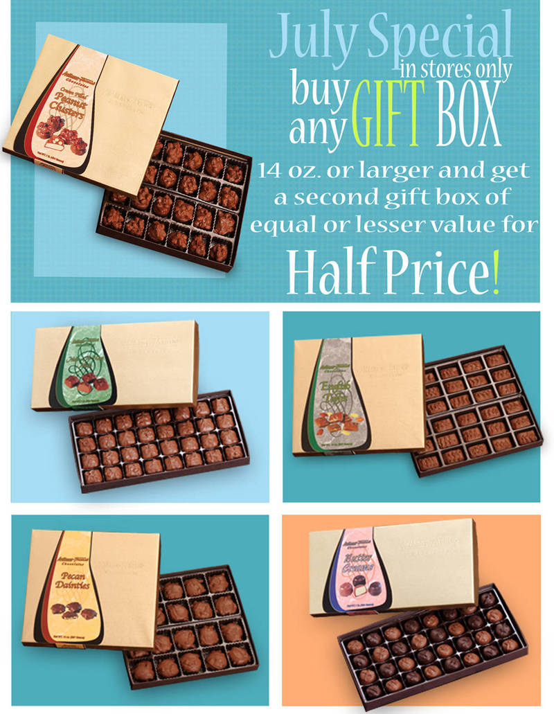
The July box sale, I needed to use bright colors to excite the eye. Pastel blues, add a cool, refreshing, feel, since chocolate tends to melt easily in the summer heat. The white was to aide with preventing clutter of the many boxes.
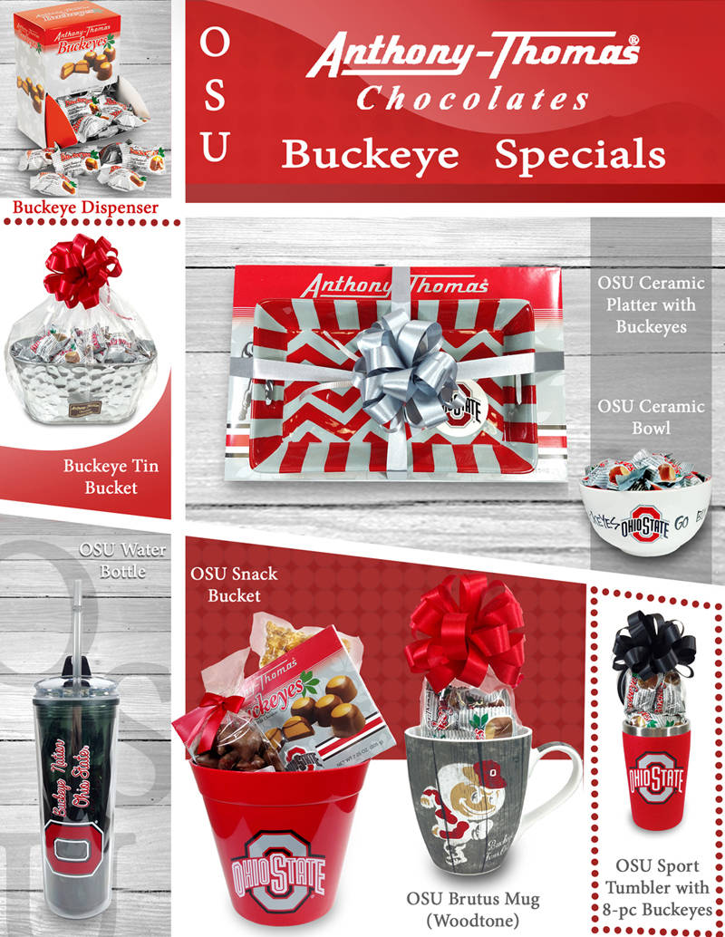
New OSU items were received, and the public needed to know about them. I used the standard colors for the buckeyes of grey and red. I added textures and different angles to keep the sign interesting. I photographed all the photos, but the top left corner image.

The Blizzard box sale. I decided to design a street covered in snow from a blizzard. The snow pile allowed me to showcase the product in the foreground. I added the client's sign in the background.
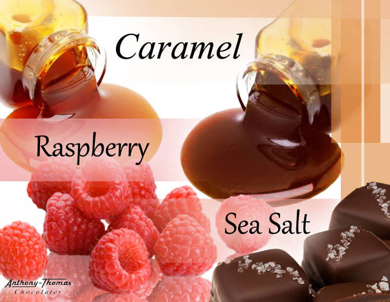
A new product of Raspberry, Sea Salt, and Caramel.

Website: Slides and BannersThese images were for digital advertisement on the website, and the larger versions for email ad campaigns.

I decided on creating a stylized spring scene to help sell the new Mother's Day mug.

I photographed the strawberries and chocolates myself. This was to help the new item's awareness.
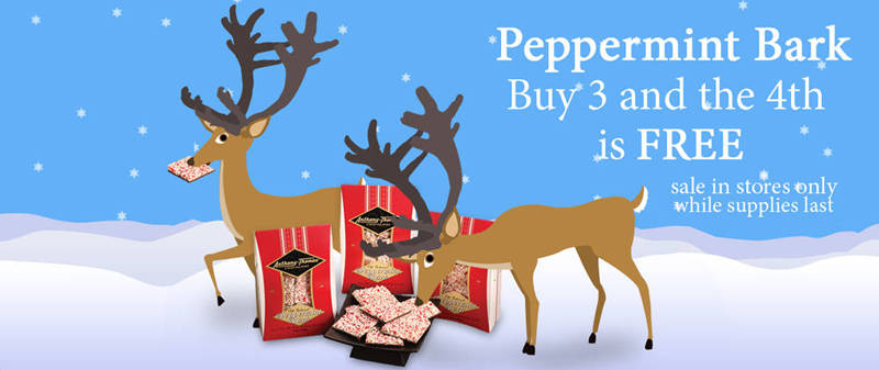
Stylized winter scene, with blue which helps the red of the peppermint bark pop-out. Even the deer like bark, even when they shouldn't be stealing the treats.

Another Stylized winter scene. Snow people baring gifts. Product photographed by me. *Note. These ads, helped raise email click rates, and sales of the holiday products.
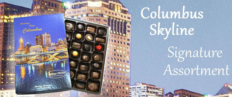
New Sky line box. Simple background style design change.

A new platter item brought around Thanksgiving. I photographed the item, and built the festive holiday background.

Fliers and CataloguesSeveral selections for signs, fliers, and catalogue for wholesale.
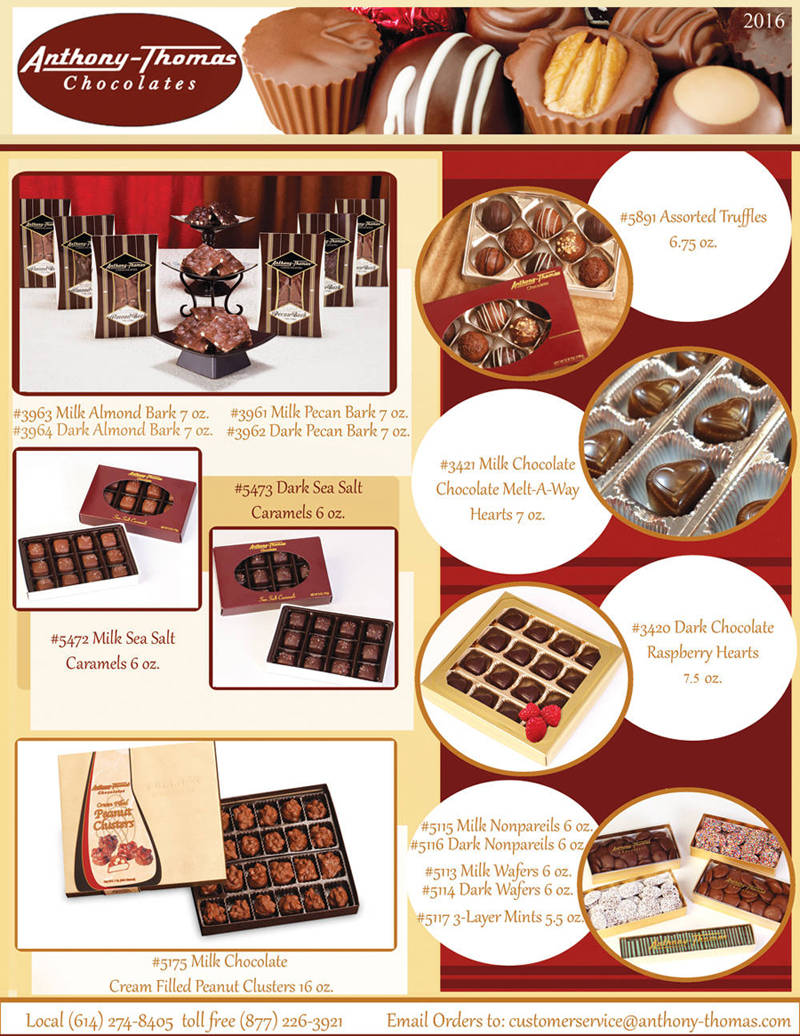
First of two pages of the wholesale catalogue that will be demonstrated on this site. The images were taken by a photographer not under my supervision. I had many items and text to work with, attempting to keep the pages from being an index.
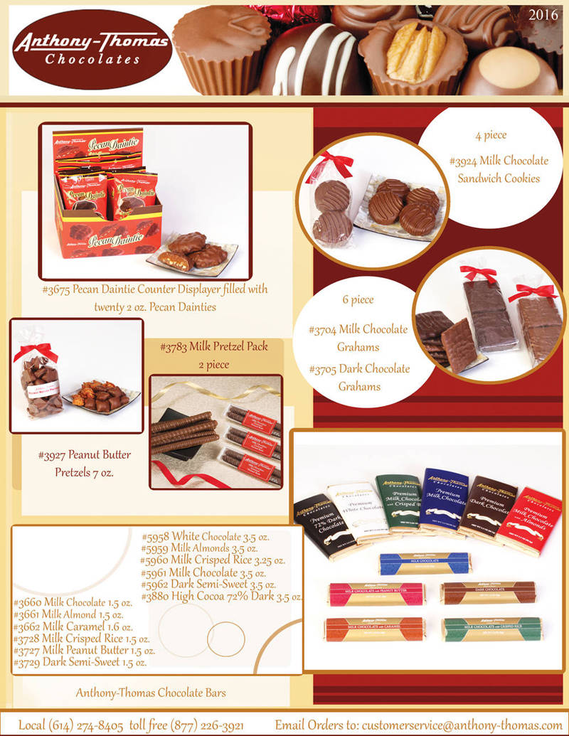
I chose circles and squares to help text overload. The colors I used were with the color-scheme of the company logo.
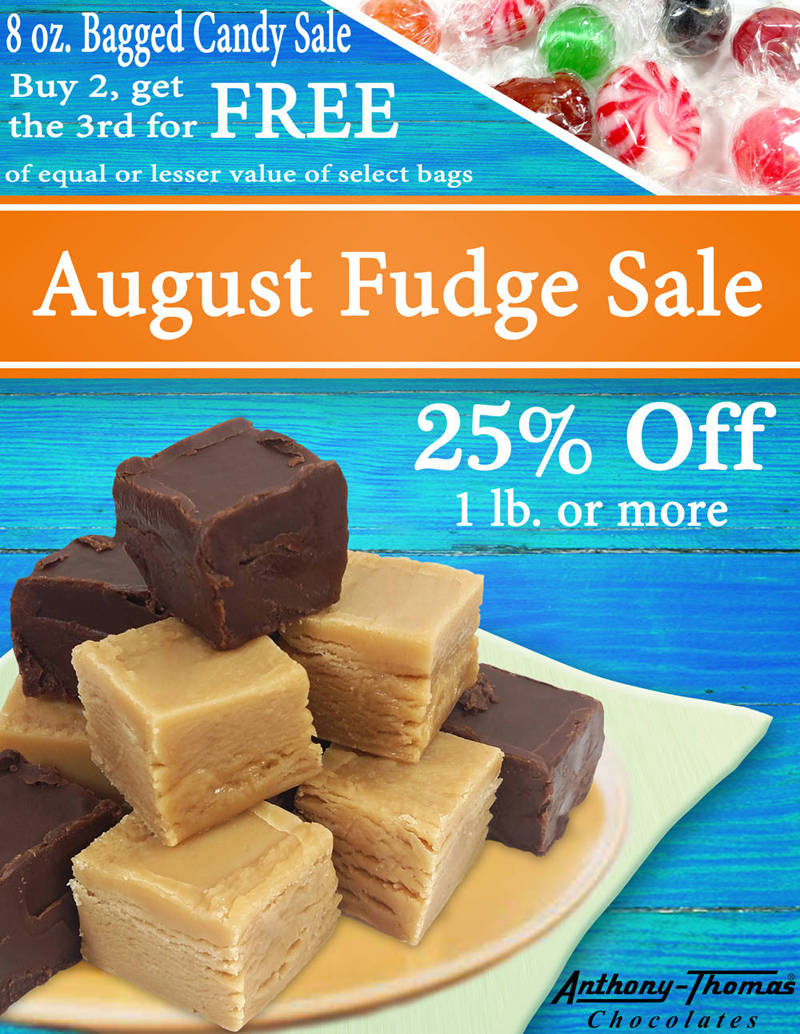
I photographed the fudge, since the old sign was not using the client's fudge. I used bold, bright colors, to catch the eye. The area where the sign stood, was far from the entrances, and needed to attract attention.

I created stylized roses to help entice anyone within sight of the sign, and to make the chocolate roses more appealing.